Lime
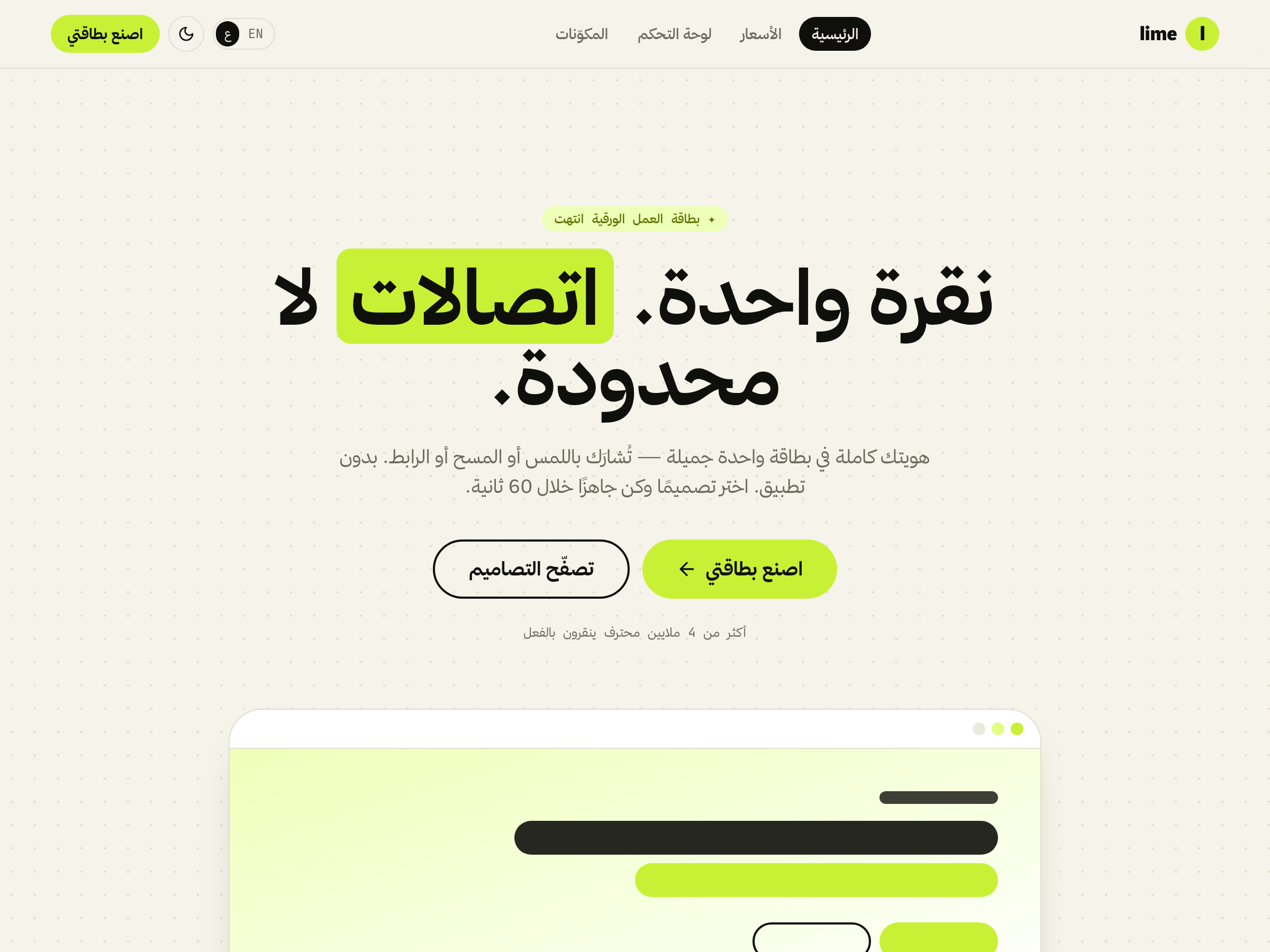
من المجتمع جاهزة للذكاء الاصطناعيحزمة منتج بنكهة الليمون — كريمي دافئ وحبر شبه أسود ولمسة ليمون حمضي زاهية. خط Hanken Grotesk عريض للعناوين، تسميات أحادية المسافة، عناوين بخطّ تحديد، شريط متحرّك وأقسام «بنتو» داكنة. فاتح وداكن، عربي/إنجليزي مع RTL. تطبيق React جاهز للتشغيل.
جاهزة للذكاء الاصطناعي
ابنِها بأداة الذكاء الاصطناعي
الصق هذا في Claude Code أو Cursor أو Codex. تقرأ الأداة مواصفة التصميم من الرابط، وتعيد نفس الألوان والخطوط ونصف القطر والمكوّنات بالضبط — داخل مشروعك أنت.
Build me a website styled exactly like this design: https://uikit.studio/kit/lime — it's agent-ready. Read the spec at https://uikit.studio/kit/lime/llms.txt and match its color tokens (light + dark), fonts, radius and components. Keep full dark mode and a responsive layout.
المواصفة
llms.txtموجز التصميم للأدوات الذكيةmanifest.jsonالألوان · الخطوط · المكوّناتمتاحة في كل صفحات الموقع عبر /llms.txt
عرض مباشر
لقطات
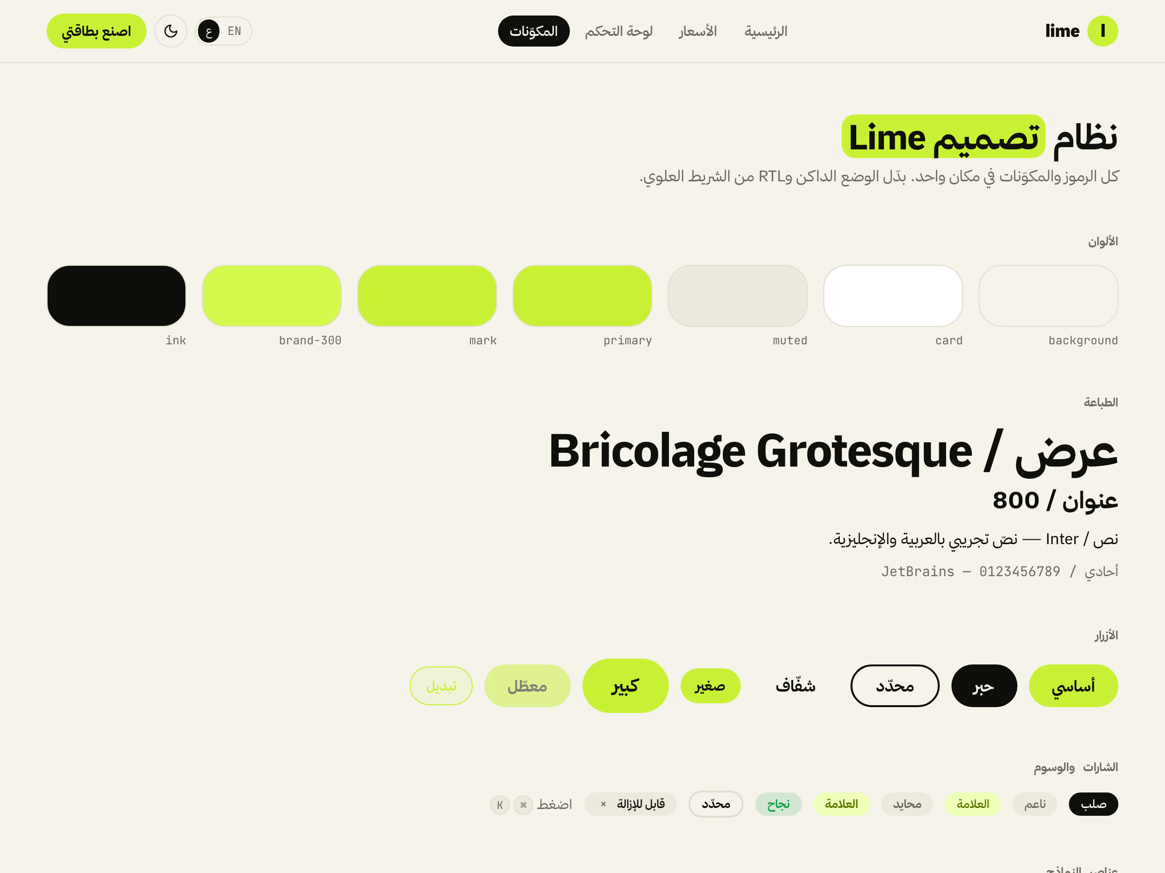
الألوان
تدرّج لون العلامة، مع ألوان الوضعين الفاتح والداكن اللي تجيك مع الحزمة.
فاتح
#c8f135#c8f135#f5f3ea#0f0f0c#ffffff#ece9dd#e2ded0داكن
#0e0e0b#f4f3ea#18180f#c8f135#1f1f15#2b2b1eالخطوط
The quick brown fox
Bricolage Grotesque
العناوين
The quick brown fox jumps over the lazy dog
Inter
النص
const ship = () => fast
JetBrains Mono
أحادي / تسميات
الموجّه
الموجز اللي طلعت منه هذي الحزمة عبر uikit-standard.
A limey digital-business-card kit — warm cream + near-black ink + a vivid acid-lime accent, heavy Hanken Grotesk display, monospace micro-labels, highlight-marker headings, a marquee and dark bento sections. React-first. Full dark mode and EN/AR + RTL. Ship landing, pricing, dashboard, and a components showcase.
- 1Forked an existing kit with `uikit-cli new`, then reskinned its identity.
- 2Tokens (tokens.json) → theme.css: lime brand scale, cream/ink, dark block, [dir=rtl] Arabic font swap, Hanken Grotesk display.
- 3i18n (en + ar): a digital-card narrative — taps, designs, NFC/QR, lead capture.
- 4Reused the design system: cn, Button, Card, Input, Badge, Pill, Mark, Marquee, Container; Navbar/Footer/StatCards blocks.
- 5Four pages: Landing (hero · marquee · designs grid · dark bento · CTA), Pricing, Dashboard, Components showcase. Validated with `uikit-cli validate`.
وش فيها
المكوّنات
الكتل
القوالب
//pricing/dashboard/components