Admax
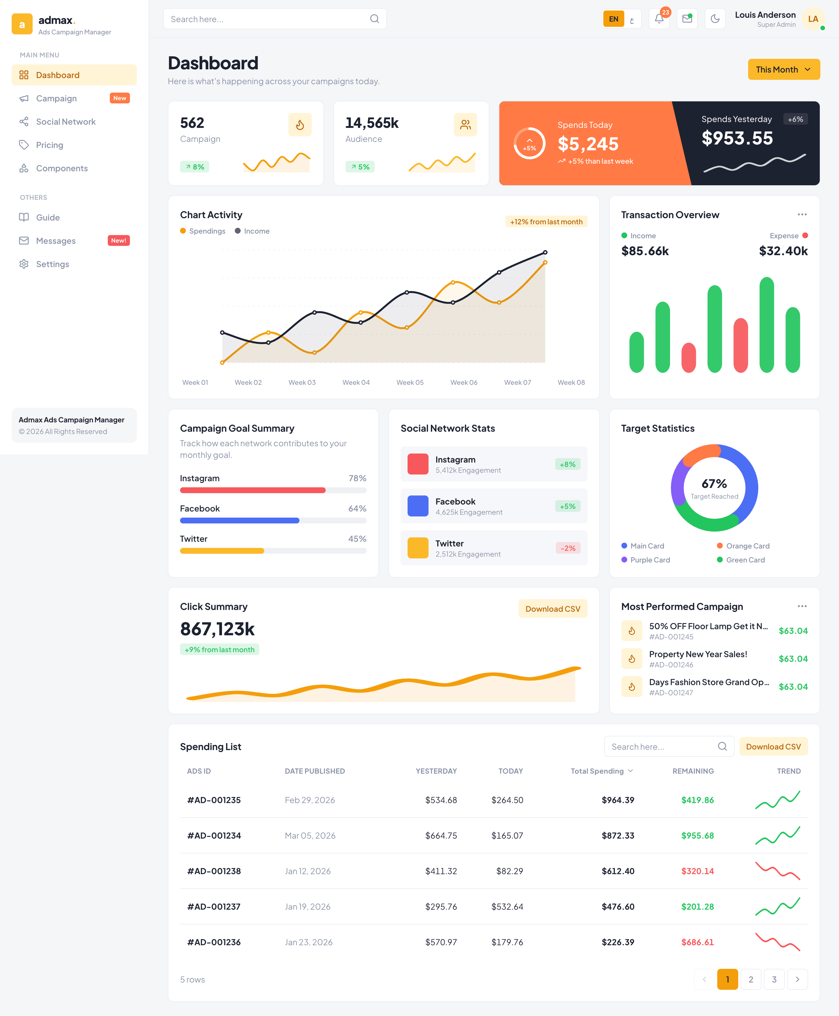
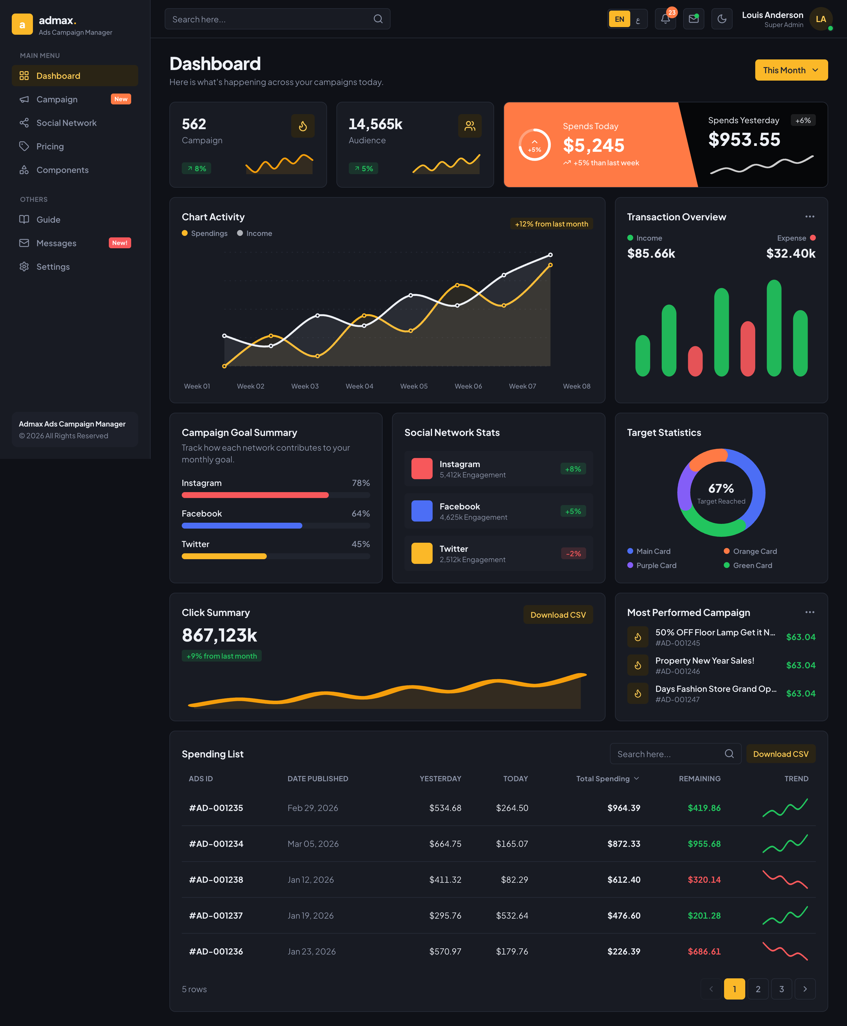
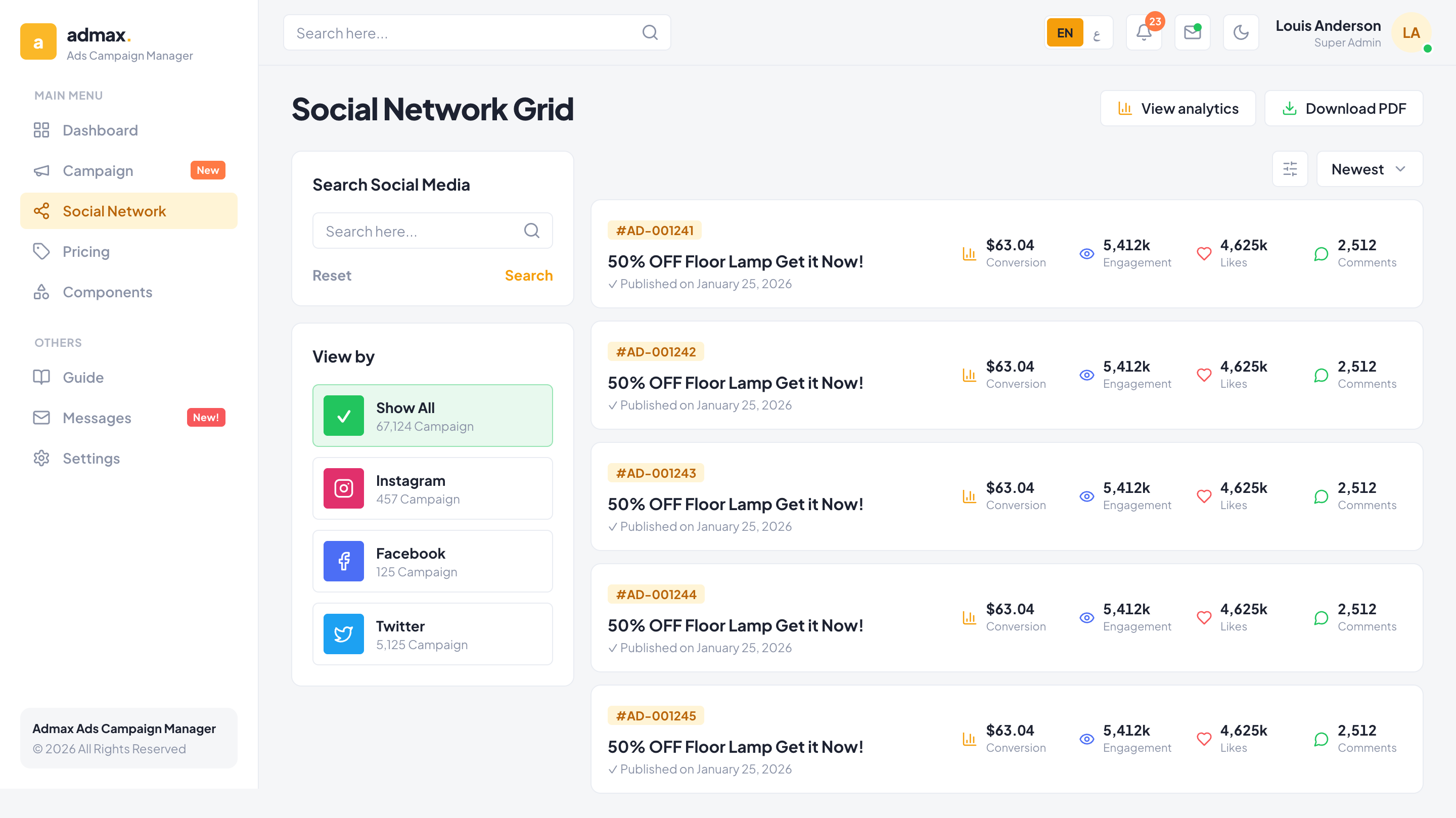
community agent-readyA dashboard-first admin kit for ad-campaign tooling. Truly flat — no gradients, no shadows: a sunny amber/gold brand, an orange 'spends' accent and candy status colors (green = running/income, red = paused/expense, slate = expired) over a warm off-white canvas with tight radii. Dense dashboard (KPIs + sparklines, spends banner, line/candlestick/donut charts, a sortable spending table), a campaign monitor, a social network grid, pricing and a full components showcase. EN/AR with full RTL, light + dark. Runnable React app.
agent-ready
Build this with your AI agent
Paste this into Claude Code, Cursor or Codex. The agent reads the machine-readable design spec at this URL and reproduces the exact tokens, fonts, radius and components — in your stack.
Build me a website styled exactly like this design: https://uikit.studio/kit/admax — it's agent-ready. Read the spec at https://uikit.studio/kit/admax/llms.txt and match its color tokens (light + dark), fonts, radius and components. Keep full dark mode and a responsive layout.
the spec
llms.txtdesign brief for agentsmanifest.jsontokens · fonts · componentsDiscoverable site-wide at /llms.txt
live preview
screenshots

colors
Brand scale, plus the light and dark semantic tokens the kit ships with.
light
#f59e0b#ff7a45#22c55e#f7585b#f5f6f8#1d2231#ffffff#eef0f4#e9ecf2dark
#0f1117#eef1f7#181b23#fbb828#20242e#272c38typography
The quick brown fox
Plus Jakarta Sans
display
The quick brown fox jumps over the lazy dog
Plus Jakarta Sans
sans / body
const ship = () => fast
JetBrains Mono
mono / labels
the prompt
The brief that generated this kit via uikit-standard.
A dashboard-first ads campaign manager — truly flat (no gradients, no shadows), sunny amber/gold brand with an orange 'spends' accent and green/red/slate status colors over a warm off-white canvas. Plus Jakarta Sans + Cairo for Arabic. Ship a dense dashboard (KPI cards with sparklines, an orange/slate spends banner with a diagonal seam, a multi-series line chart, candlestick + donut, a sortable spending data table), a campaign monitor, a social network grid, pricing, and a components showcase. Dashboard is the index page. Full EN/AR + RTL and dark mode.
- 1Tokens (tokens.json) → theme.css (amber scale, flat shadows:none, tight radii, type scale, dark block, [dir=rtl] swap) → tailwind-preset.js.
- 2i18n: en + ar dictionaries + a provider that flips dir/lang.
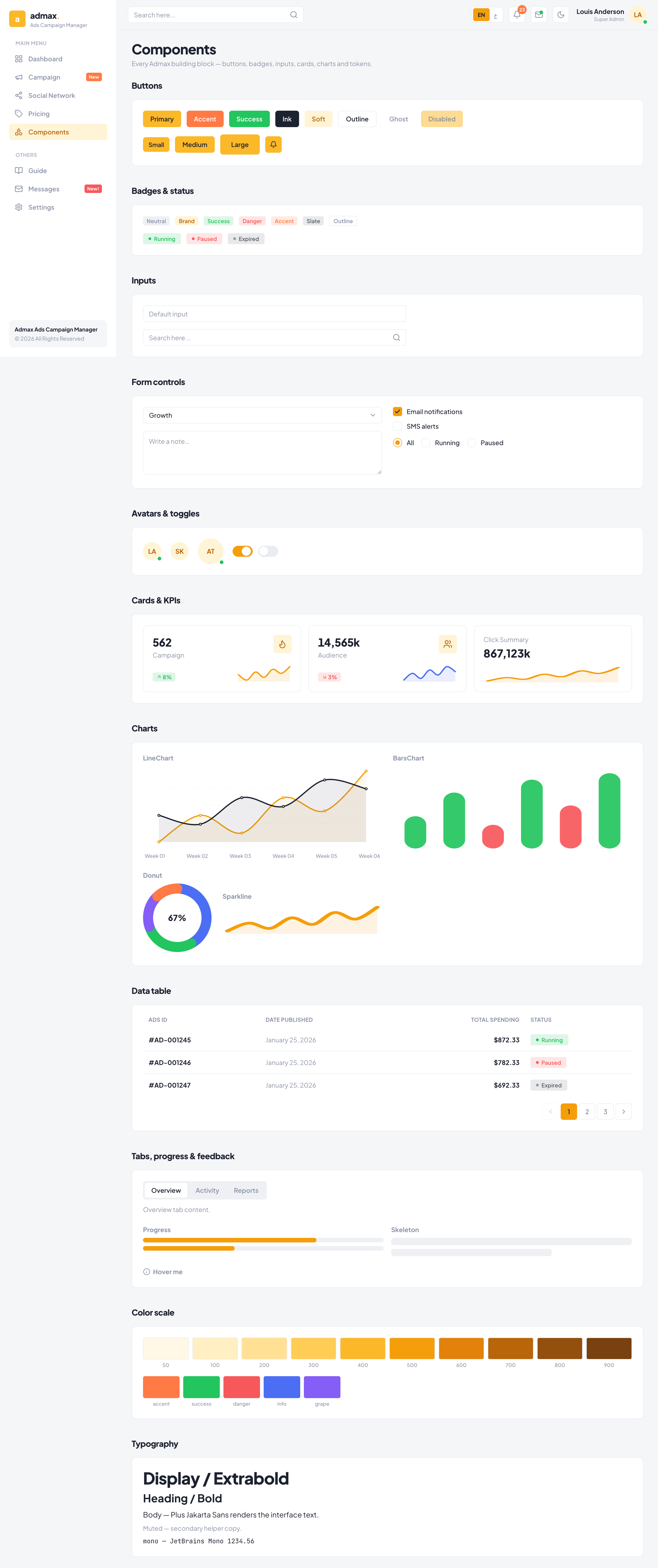
- 3Design system: cn, Button, Badge, Input, Card, Avatar, Switch, StatCard, Charts, Table, primitives.
- 4Sidebar app shell (Main Menu/Others + topbar) → pages: Dashboard (index), Campaign, Social, Pricing, Components.
- 5Agent-ready: uikit.json (validated), AGENTS.md, llms.txt, screenshots.
what's inside
components
blocks
templates
//campaign/social/pricing/components